Where it started. Who we are.
The story behind SHREEJI MRI, what it does today, and the promise that stays fixed as it grows.
It began at a father's radiology centre, where a son training in radiology found his focus early: MRI.
As a second-generation doctor, he set out to prove his potential at a larger scale - by introducing an idea that was still early for the region: a standalone centre dedicated only to MRI. That centre became SHREEJI MRI.
- SHREEJI MRI runs multiple standalone MRI centres across South Gujarat.
- Beyond its own centres, SHREEJI MRI provides and manages MRI scanners for hospitals, institutions, and dedicated neuro and musculoskeletal centres.
- MRI is the only thing SHREEJI MRI does. Planning, sourcing, managing and reporting - every stage is handled in-house, across 100+ MRI protocols.
- Patients get rapid, comfortable scanning with precise, fast reporting.
- Consultant doctors get clear, fast and effective communication, especially in critical cases.
- A team of highly skilled, experienced radiologists stands behind every report.
No patient should wait longer than they need to, pay an unclear price, or receive less care than they deserve.
- Grow across Gujarat first, then across India.
- Bring Gujarat its first privately-owned Open MRI, for patients who can't manage the closed-bore machines most centres use.
- Growth is self-funded, one centre at a time - not backed by outside investors chasing faster expansion.
- Slower this way, but it keeps prices fair as the brand grows.
This doesn't change, no matter how big SHREEJI MRI gets.
Calm. Straightforward. Precise.
How SHREEJI MRI sounds - to an anxious patient and a careful doctor, in the same words.
Patients are anxious about the scan itself. Doctors who send patients worry about their own reputation if they send someone to the wrong place. The brand has to feel calm and caring to patients, while still feeling capable and reliable to doctors - at the same time, with the same words.
Steady and reassuring, like someone who has done this many times before and won't panic, no matter how worried the patient is.
Says things plainly. One price. A report that means what it says. No hiding behind jargon, no oversized claims.
Careful and accurate, every time - not because someone is checking, but because that's simply the standard here.
Warm, premium, simple, caring. These come naturally once Calm, Straightforward, and Precise are done right - they aren't things to force on their own.
- Never "best" - we don't need to compare ourselves to anyone else.
- Never "cheap" - it sounds like something was cut back.
- Never calls itself "trustworthy" - that's for patients and doctors to say, not us.
One discipline. Done precisely.
Who SHREEJI MRI serves, what it stands against, and what makes it hard to copy.
Neurophysicians, orthopedists, oncosurgeons, spine surgeons - who need to know the scan, the report and the communication will hold up, every time.
Aged 25-75, usually coming in for neurological or orthopedic concerns, or cancer follow-up scans. They are anxious, in a hurry, and often don't know what to expect from the scan.
Hospitals, institutions and specialist centres that need MRI planned, installed and managed properly.
Other centres (Horizon, Life Scan, Future, STC) offer X-ray, ultrasound, CT and MRI together. SHREEJI MRI does only MRI - that focus is the whole point.
Pricing across multi-service centres isn't always clear. SHREEJI MRI keeps it to one clear price.
Waiting for results is already stressful for patients, and a delayed or vague report leaves doctors without what they need. Both are treated as failures here.
Not price alone - price can be copied. What's harder to copy: a specialist-led organisation that does only MRI, handles every stage from planning to reporting, runs 100+ protocols across multiple centres, and keeps a direct line open to consultant doctors when a case is critical.
Know your body.
The tagline, and the naming system for every service SHREEJI MRI offers.
Of the four candidate directions (Through your body / Know your body / Scan your body / Visualise your body), this reframes the service - a scan - as an outcome: understanding. It speaks to the clarity the brand delivers to patients and doctors alike, and stays plainspoken rather than drifting into abstraction.
Pattern: [Region]-MRI, hyphenated, title case.
Sub-brand icons/submarks are a future phase, not part of this current build. Naming and endorsement logic are locked now so nothing needs revisiting later.
Precision, resolving into clarity.
The logo, its lockups, the colour palette and the type system.
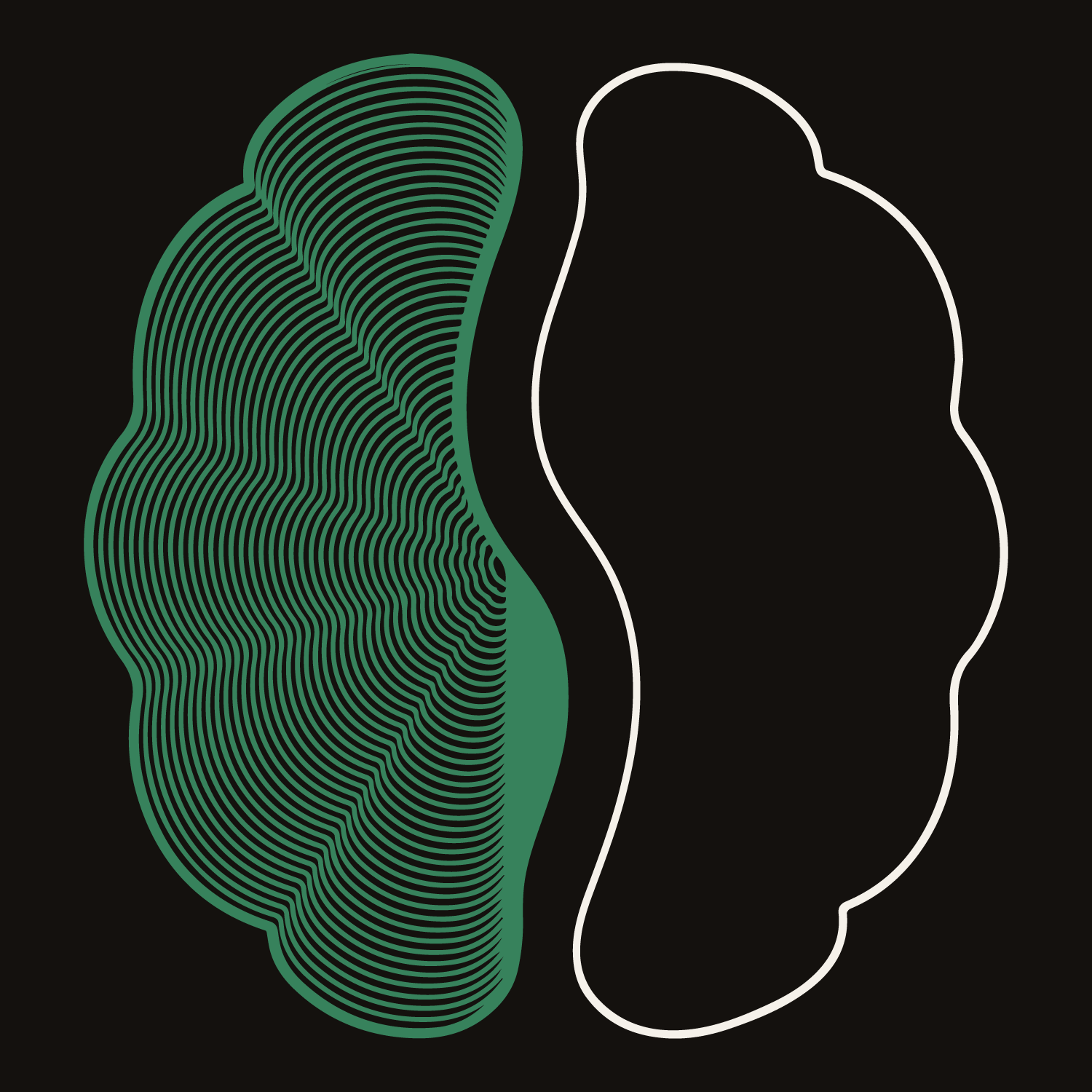
The mark is a split brain-hemisphere icon built on a single, unified idea: precision resolving into clarity.
The left hemisphere is rendered in fine, concentric contour lines, filled in green - detail, process, the exacting work of an actual scan and read. The right hemisphere is a clean, open outline - resolved, calm, the answer once it arrives.
Between them sits the entire concept, made literal: the negative space where the two halves meet forms an implied "S" - the first letter of SHREEJI, and the bridge between the two states the brand exists to carry someone across. Precision on one side. Calm on the other. The "S" is the crossing between them - which is, in effect, what the centre itself does for every patient who walks in anxious and leaves with an answer.
Fill, outline, and the bridge between them are one continuous idea, and every future application of the logo should be built with that in mind - the bridge should never be visually broken, obscured, or crowded out by adjacent elements.
"SHREEJI MRI" set in Encode Sans Semi Expanded, monochrome. "DIAGNOSTIC IMAGING CENTRE" beneath it, in the brand green, with generous letter-spacing.
Icon on the left, wordmark and descriptor stacked to its right, both left-aligned to a shared starting edge. Icon height approximately 1.2-1.3x the combined height of the two-line text block. Icon bottom-aligned to the base of the full text block.
Icon centered, wordmark and descriptor centered beneath it, equal width, descriptor sized at roughly 36-37% of the wordmark's height.
The icon never changes across language versions - only the wordmark typeface adapts to the required script.

Used alone where the full lockup can't be read - favicons, app icons, social profile pictures. The favicon cut uses a heavier outline and a solid cream fill so the mark holds up at very small sizes.
Latin script only.
ExtraBold is used for critical highlights in reports and flagged values.
The icon never changes across language versions - only the wordmark typeface adapts to the required script. Body text in Hindi/Gujarati uses the same Noto Sans family logic (Regular / SemiBold / ExtraBold) at matching weights.
Font files will be shared and installed directly, ensuring consistent rendering across every device and platform - Windows, Mac, Google Docs, Canva, or otherwise.
The right version, every time.
Which lockup goes where, how much room it needs, and what is never allowed.
All sides: equal to the cap-height of the "S" in SHREEJI, measured at whatever size the logo is reproduced. This scales proportionally and stays practical from signage down to a business card.
- Any background colour outside the three-colour palette
- Recolouring the wordmark or descriptor outside the specified monochrome/green pairing
- Placing the logo on a busy photographic background without sufficient contrast behind it
- Stretching, skewing, or rotating any part of the lockup
- Separating the icon's two hemispheres or altering their fill/outline relationship
- Recreating the wordmark in any typeface other than the approved system
Bright rooms. Dark frames.
How the real clinic is photographed, and where the premium dark layer belongs.
SHREEJI MRI's physical space is clean, white, well-lit - that's real, and photography should represent it accurately, not stylize it into something moodier or darker than it is.
- Genuine clinic interiors - real equipment, real space, natural or well-balanced lighting
- Calm, uncluttered compositions - negative space and clean framing communicate calm and precision
- Close, confident detail shots - controls, machine surfaces, precise instrumentation, shot with good light
- Real staff and real interactions, shot naturally rather than staged
- Bright, clean, accurate to what a patient will actually walk into
- Closed-bore shots, or framing that emphasizes enclosure - a direct anxiety trigger for these patients
- Artificially darkened, moody, or colour-graded clinical photography
- Harsh, flat, overexposed fluorescent lighting
- Generic "smiling stock patient" photography
- Cluttered, busy frames
The dark, ambient, premium feeling (#14110E backgrounds, green accents) belongs to the brand's built environment - website, social templates, signage backgrounds, brochures - not to the photography itself.
A bright, accurately-lit clinic photograph can sit within a dark-background page layout, or have a dark gradient overlay applied only where text needs to sit on top of it for legibility. The photo itself stays true to the real space; the surrounding design carries the premium, ambient feeling.
Where copy overlays a photo, apply an overlay - a gradient or a solid fill - behind the text, using cream (#F5F1EA) or near-black (#14110E) as needed for contrast. A full-image overlay is approved where needed for legibility, not just a partial one.
Colour, applied.
Exactly which colour goes where - in dark mode, light mode and patient reports.
Website, social media, hoardings, digital ads, signage
Print materials, reports, letterhead, brochures, business cards, some social
Patient-facing MRI reports specifically
Ready to paste.
Prompt blocks that keep AI-generated copy and visuals on-brand.
Paste the relevant block before any specific request - no other explanation needed.